Graphical Analysis
Graphics analysis enables you to visualize and understand your data in a graphical form. It is used to study and explore significant relationships among variables (input and output). Graphical analysis is also useful in stratifying great deal of data quickly to identify vital input variables for further analysis such as regression and DOE. The type of graphical tool used depends on the purpose of the study and the type of data that is available. The following are explanations and example of the common and more useful graphical tools available.
Pareto Chart
The Pareto chart is similar to a bar chart where the values being plotted are arranged in descending order. There is also a line plotted that represents the cumulative percentage of the values plotted. Although the vertical axis of the chart is usually the frequency of occurrence, but it can also be other important units of measures like costs or time. The purpose of a Pareto chart is to distinguish the vital few factors among the trivial many and it is based on the 80-20 rules (80% of the problems arises due to 20% of the cause). It iis commonly used to highlight the most frequently occurring defect or highlight the highest occurring cause of failure (e.g. customer complaints).

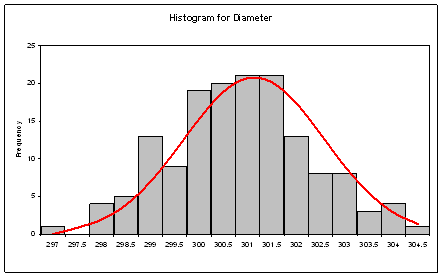
Histogram
The histogram is used to graphically summarise and display the distribution of a data set. The horizontal axis is usually made up of regular intervals that span the entire range of the data set and the height of the bars represents the frequency of occurrence within each interval. The intervals are non-overlapping and equal in magnitude.
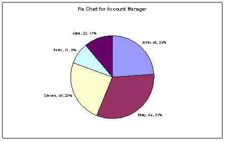
Pie Chart
The pie chart is a circular chart divided into sectors and each sector represents the relative magnitudes or frequencies or percents. It is used t o visualise contribution to the whole by different segments. When there are too many segments, the minor segments are usually combined to give more clarity to the chart.
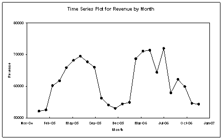
Time Series Plot
The time series plot charts the values of a variable against time. It is used to study trends over time.
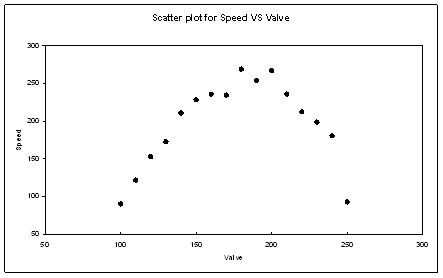
Scatter Plot
The scatter plot displays values for two variables for a set of data. The independent variable is usually plotted on the horizontal axis and the dependent variable on the vertical axis. The iindependent variable can be attribute or continuous data but the dependent variable must be of a continuous nature. The scatter plot is normally used to visualise correlations between variables before performing more complex analysis like the regression.
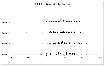
Dotplot
The dotplot is similar to the histogram but data points represented by dots instead. If there are more than one data points of the same value or within the same interval, the dots are stacked vertically. For a large data set, one dot may even represent several data points. Like the histogram, the dotplot can be used to display the distribution of a data set, but it is more used for its ability to compare the distribution of several data sets or subgroups.
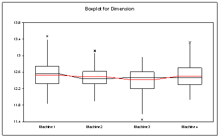
Boxplot
The boxplot (also known as a box-and-whisker plot) is used to visualise a set of data through iits five characteristics (smallest observation, lower quartile (Q1), median, upper quartile (Q3), and largest observation). It also displays data points that are considered outliers which are represented as asterisks. A Boxplot can display the distribution of several sets of data without making any assumptions of the underlying statistical distribution. The size of the box and the length of the whiskers help to indicate the variance and skewness of the data.
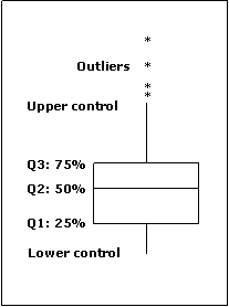
Boxplots are commonly used to visualize correlation between variables, compare distributions and to estimate the impact of an independent variable on its dependent variable.
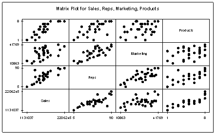
Matrix Plot
The Matrix Plot is made up of individual scatter plots for several variables. It is useful for visualizing the relationship among many variables, pairwise, all in the same chart. It can be used to visualize correlation between one dependent variable versus several independent variables. It an also be used to visualise colinearity between several independent variables.
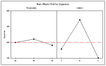
Main Effects Plot
The Main Effects plot is used to compare the magnitudes of main effects of multiple factors on the response variable. The points in the plot are the means of the response variable at the various levels of each factor. A reference line is also drawn at the overall mean of the response data. Main Effects plots are commonly used together with the ANOVA analysis and DOE.
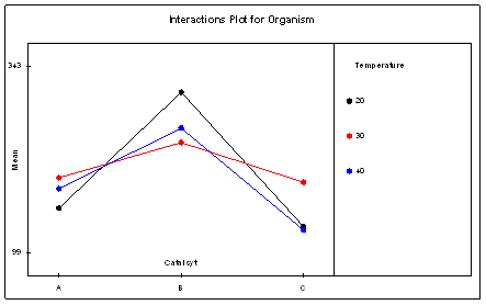
Interactions Plot
The Interactions Plot is used to visualise the presence of interaction among several factors. Interaction is present when the response at a factor level depends upon the level(s) of other factors. When interactions are not present, the lines in an interactions plot will be parallel. If there are three factors or more, a matrix of interaction plots is created. Interactions Plots are commonly used together with the ANOVA analysis and DOE.